Talk:Reclusa
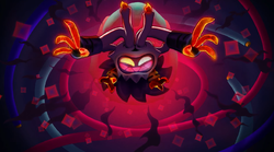
I think we should use Reclusa's In-game artwork for the infobox
I think we should use the in-game artwork of Reclusa over the current screenshot.
Here is how I think it should look:
| Reclusa | |
|---|---|
 In-game artwork of Reclusa from when Shun talks about Reclusa's backstory | |
| First appearance | Mario & Luigi: Brothership (2024) |
Here is how it currently is:
| Reclusa | |
|---|---|
 Reclusa's appearance in-game | |
| First appearance | Mario & Luigi: Brothership (2024) |
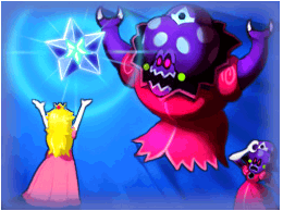
Elder Princess Shroob's page currently uses in-game artwork, as there is no official artwork on any Nintendo website for her.
| Reclusa | |
|---|---|
 In-game artwork of the Elder Princess Shroob's battle with Princess Peach | |
| Species | Shroob |
| First appearance | Mario & Luigi: Partners in Time (2005) |
| Latest appearance | Mario & Luigi: Bowser's Inside Story + Bowser Jr.'s Journey (cameo) (2018) |
Reclusa and the Elder Shroob are both similar in that neither were featured in the promotional materials and are revealed to be the main villains late game. I think my edit is not only more in-line with the Elder Shroob page, it is my opinion that it makes the page look nicer. Nightwicked Bowser (talk) thinks the current screenshot is better, so I say we put it to a vote and let people vote on it.
Proposer: Polterpup (talk)
Deadline: December 3, 2024, 23:59 GMT
Support
Oppose
- Technetium (talk) Elder Princess Shroob's art shows her entire body clearly, while Reclusa's art doesn't.
- Nightwicked Bowser (talk) As I said, the lighting and coloring are not great in the artwork and also not fully accurate to Reclusa's main depiction, whereas the Elder Princess Shroob artwork is.
Comments
Does this need a proposal? Couldn't we have just discussed this first? Not every discussion has to become a proposal. Technetium (talk) 17:32, November 19, 2024 (EST)
