List of fonts: Difference between revisions
Raymondsze (talk | contribs) No edit summary |
Raymondsze (talk | contribs) |
||
| Line 290: | Line 290: | ||
[[File:Little Mac intro.png|thumb|DF Gothic is used for the fighter introduction screens in the latest ''[[Super Smash Bros. (series)|Super Smash Bros.]]'' games.]] | [[File:Little Mac intro.png|thumb|DF Gothic is used for the fighter introduction screens in the latest ''[[Super Smash Bros. (series)|Super Smash Bros.]]'' games.]] | ||
'''DF Gothic''' ( | '''DF Gothic''' (DFゴシック体 ''DF Goshikku-tai'') is a sans serif typeface from Fontworks.<ref name="DFGothic">Fontworks. DFゴシック体 Pro. https://lets.fontworks.co.jp/fonts/645. Retrieved June 20, 2024.</ref> It is most prominently used in ''[[Super Smash Bros. (series)|Super Smash Bros.]]'' games, with the exception of ''[[Super Smash Bros. Ultimate|Ultimate]]''. In the original ''[[Super Smash Bros.]]'', it is used for pre-match loading screens in the 1P Game, as well as unlock messages; in ''[[Super Smash Bros. Melee|Melee]]'' and ''[[Super Smash Bros. Brawl|Brawl]]'', it is used for How to Play; and in ''[[Super Smash Bros. for Nintendo 3DS]]''/''[[Super Smash Bros. for Wii U|Wii U]]'', it is the primary large text font. | ||
It is also has minor usage in ''[[Mario Kart 8]]'' and ''[[Mario Kart 8 Deluxe]]'' on the [[List of sponsors debuting in Mario Kart 8 and Mario Kart 8 Deluxe#Bullet Bill Speed Trials|Bullet Bill Speed Trials]] logo, which uses its Ultra Heavy (DFP超極太ゴシック体) font. | It is also has minor usage in ''[[Mario Kart 8]]'' and ''[[Mario Kart 8 Deluxe]]'' on the [[List of sponsors debuting in Mario Kart 8 and Mario Kart 8 Deluxe#Bullet Bill Speed Trials|Bullet Bill Speed Trials]] logo, which uses its Ultra Heavy (DFP超極太ゴシック体) font. | ||
Revision as of 08:45, June 20, 2024
It has been requested that more images be uploaded for this article. Remove this notice only after the additional images have been added. Specific(s): Illustrate all fonts listed
This is a list of typefaces used in games and related media within the Super Mario franchise.
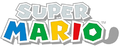
Classic Super Mario typeface

The first Super Mario font is an uneven sans serif typeface designed by Nintendo in 1988. It is used for the logos and, later, interfaces of Super Mario games from Super Mario Bros. 3 to Mario & Sonic at the London 2012 Olympic Games.
Though mostly the same, a second version of the font was designed following the release of Super Mario 64, which would take over as the primary version from then on. It lacked a fully defined character set, which led to many different interpretations. In particular, the font does not have a consistent design for Japanese hiragana, katakana, or kanji. This remained the case for the font even after the overhaul, likely inciting the shift over to the modern Super Mario font.
Used in tandem with other fonts throughout the 2000's, it was fully replaced with the modern font with the release of Super Mario 3D Land, being last seen on the logo for Mario & Sonic at the London 2012 Olympic Games, albeit an early logo for Paper Mario: Sticker Star used a design partially based on this typeface before being changed to the modern Super Mario typeface for the final release.
Modern Super Mario typeface

The modern Super Mario typeface is an uneven sans serif typeface designed by Nintendo in the early 2010s. It was experimented with by Nintendo in the lead up to the release of the Nintendo 3DS and Wii U, with the first use of the modern font appearing in the spine art of Super Mario Galaxy 2. Early versions appeared in games such as Mario Sports Mix, featuring a character set closer to the classic font. The font in its current form was officially introduced with the release of Super Mario 3D Land in 2011 and has since become the singular Super Mario typeface, used for logos, menus, HUDs, and other text across the Super Mario franchise.
The font is officially called "MARIO Font" and was created in collaboration with Fontworks, a foundry whose fonts are often used in Nintendo games. Unlike the previous font, this font has full character sets for hiragana and katakana, as well as some kanji and Cyrillic characters. The font has been revised at least three times; the latest revision of the font is version 3.203, revised on August 20, 2019.[1]

Mario Sports Mix logo with the early version
Preliminary logo for Super Mario 3D Land, featuring the final font but with classic colors
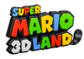
Logo for Super Mario 3D Land
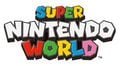
Logo for Super Nintendo World
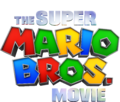
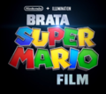
English/international logo for The Super Mario Bros. Movie
Slovenian logo for The Super Mario Bros. Movie with the "SUPER MARIO" in the modern font, which is also used for the Lithuanian and Vietnamese logos
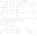
All characters in the modern Super Mario font

Nintendo's recruitment book 2020
![Lettering seen in the May 2023 game update trailer for the Game Boy Advance - Nintendo Switch Online application[2]](https://mario.wiki.gallery/images/thumb/4/45/GBA-NSO_trailer_2023-05_screenshot_-_available_may_26.jpg/120px-GBA-NSO_trailer_2023-05_screenshot_-_available_may_26.jpg)
Lettering seen in the May 2023 game update trailer for the Game Boy Advance - Nintendo Switch Online application[2]
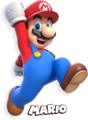
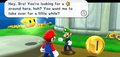
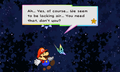
Picture of Mario in which his name, using this typeface, is also shown
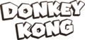
Donkey Kong's name

Luigi's name
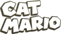
Cat Mario's name

Toad's name
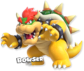
Picture of Bowser in which his name, using this typeface, is also shown

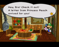
Peach's name

Traditional Chinese logo for the Mario Dōjō event held at Nintendo Live 2023 HONGKONG and Nintendo Live 2023 TAIPEI


![Lettering seen in the May 2023 game update trailer for the Game Boy Advance - Nintendo Switch Online application[2]](/File:GBA-NSO_trailer_2023-05_screenshot_-_available_may_26.jpg)


Modern Super Mario Bros. typeface
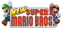
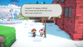
The modern Super Mario Bros. typeface is first seen in New Super Mario Bros.. This is based on the in-game logo for Super Mario Bros., which was in turn used as the logotype for the Super Mario All-Stars version of Super Mario Bros., as well as Super Mario Bros. Deluxe. It is geometrical with vertical stems with circular joints for shapes such as "A" and "M" and horizontal strokes that end before meeting left-hand vertical stems. Super Mario Bros. Wonder introduces a lowercase set of characters for this typeface.
Other than every New Super Mario Bros. game logo as well as Puzzle & Dragons: Super Mario Bros. Edition and Super Mario Run, it is also seen in Mario Super Sluggers and Super Mario Bros. Wonder for display text, as well as in The Super Mario Bros. Movie for the Super Mario Bros. Plumbing logo.

New Super Mario Bros.
Mario Super Sluggers
Super Mario Bros. Plumbing
Lowercase characters, as seen in Super Mario Bros. Wonder
The preliminary logo for New Super Mario Bros. used a design drawn from Super Mario Bros. Deluxe


Classic HUD typeface

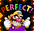
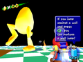
This design was used from Super Mario 64 until Mario and Sonic at the London 2012 Olympic Games for the Nintendo 3DS, appearing throughout games on the Nintendo 64, GameCube, and Wii. Some of its distinct features are the pointed, obelisk-shaped "A", the flat, wide "E", and the overall stocky, top-larger-than-bottom measures, giving it a more whimsical appearance if compared to earlier Super Mario typefaces, which were designed in the opposite way.
This typeface was primarily used for in-game text outside of dialogue (i.e HUDs and menus). Given the lack of standardization on the first Super Mario typeface, this one was also often used for placeholder logos, at times when new characters for the first font could not be drawn. It was also used for the logo of Super Mario Sunshine.
Super Mario 64 "Press Start" screen
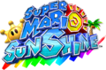
Super Mario Sunshine logo
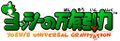
Yoshi Topsy-Turvy Japanese logo

Preliminary logo for Super Mario Galaxy
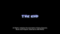
Super Mario Galaxy "The End" screen
Mario Sports Mix


Paper Mario typeface
A design similar to the classic HUD design above, used for in-game display text in Paper Mario games up to Paper Mario: Sticker Star.
Paper Mario
Paper Mario: The Thousand-Year Door
Super Paper Mario
Paper Mario: Sticker Star

The Letter "p", an item in Paper Mario: The Thousand-Year Door


Super Mario Maker typeface
The Super Mario Maker font is a geometric sans serif typeface first designed by Nintendo in 2015. It is used for the interface in Super Mario Maker, Super Mario Maker for Nintendo 3DS, and Super Mario Maker 2. The initial variant of the font was titled "MARIO30th" and lacked lowercase characters. It was revised in 2018 to include lowercase letters; this new version is named "MARIOMAKER". The latest revision of the font is version 1.3, revised on November 28, 2018.[1]
Super Mario 256
Super Mario 256 is a fanmade font designed to replicate the modern Super Mario typeface, and was created by DaFont user fsuarez913.[3] The typeface was first published online in 2012, and quickly became widespread.[4] Compared to the font it imitates, Super Mario 256 is slightly bolder and wider, and several characters are drawn at different angles.
Despite its nature as an unofficial fan project, Super Mario 256 has made its way into official media on multiple occasions. In particular, the covers for Super Mario Manga Mania and Super Mario Compact Disco – 35th Anniversary Edition, the LEGO Super Mario set "Nabbit at Toad's Shop", the logo for LEGO Super Mario Goal and the in-game score, a few social media advertisements for Super Mario 3D World and the Nintendo Switch remake of Super Mario RPG, and the Japanese Square Enix strategy guide for Super Mario RPG on Nintendo Switch feature the typeface.[5]
The cover for Super Mario Manga Mania
Album cover for Super Mario Compact Disco – 35th Anniversary Edition
Graphic promoting Super Mario 3D World

LEGO Super Mario. Super Mario 256 is seen in the sign reading "SHOP".
Character card promoting the Super Mario RPG remake
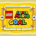
Icon for LEGO Super Mario Goal, using the font for the word "GOAL"


Mario Party Textbox
Mario Party Textbox is used for the interface in the English version of Mario Party.
Mario Party Textbox FR/DE
Mario Party Textbox FR/DE is used for the interface in the French and German versions of Mario Party.
Mario Party 2/3 Textbox

Mario Party 2/3 Textbox is, as the name implies, used for the interface in Western versions of Mario Party 2 and 3.
Mario Party 4-7 Textbox
Mario Party 4-7 Textbox is, as the name implies, used for the interface in Western versions of Mario Party 4, 5, 6, and 7, as well as Dance Dance Revolution: Mario Mix and the European version of Mario Party 8.
All characters in the font

Mario Party Hudson
Mario Party Hudson is used for large text in all Hudson Soft-developed Mario Party installments.
Rabbids typeface
A typeface internally named Rabbids is used for the interface in Mario + Rabbids Sparks of Hope for display text.
Licensed and other external designs
Ad Lib

Ad Lib is an uneven sans serif typeface designed by Freeman Craw for the American Type Founders, first released in 1961.[6] It is used for the interface in the following games:
It is also used in the logo for WarioWare, Inc.: Mega Party Game$! as well as in the instruction booklets for Mario Party 4 and 5.

Used for the "MEGA PARTY GAME$!" text

American Typewriter
American Typewriter is a serif typeface designed by Joel Kaden and Tony Stan for ITC, first released in 1974.[7] It is used for the logos for the following games:
- Mario's Picross
- Dr. Mario: Miracle Cure (ITC American Typewriter Pro Bold)


Used for the "Miracle Cure" text

Anito
Anito (アニト Anito) is a rounded sans serif typeface designed by Yutaka Satō[8] for Type Labo, first released in 2001.[9] It is used for the interface in Super Mario Maker. The typeface was also used in the tentative logo for that game during E3 2014, then named Mario Maker.
Antique Olive
Antique Olive is a sans serif typeface designed by Roger Excoffon for the Fonderie Olive, first released between 1962 and 1966.[10] It is used in the logo for Mario Tennis: Ultra Smash.
Aokane

Aokane (あおかね Aokane) is a rounded sans serif typeface designed by Yoshiharu Ōsaki for Fontworks, first released in 2015.[11] It is used for the interface in Tetris 99, the text in Mona and Penny's stages in WarioWare: Get It Together!, and text in the Pool-Party Panic stage in WarioWare: Move It!,
A-OTF Folk Pro
A-OTF Folk Pro is a sans serif typeface from Morisawa. It is used for the interface in Super Smash Bros. Melee, Super Smash Bros. Brawl, and Super Smash Bros. for Nintendo 3DS/Wii U.
Arial

Arial is a sans serif typeface designed by Patricia Saunders and Robin Nicholas for Monotype, first released in 1981.[12] It was used for the HUD of the E3 preview of New Super Mario Bros. Wii.
Arial Black is used for certain text in Super Smash Bros. Melee.
Baby Pop

Baby Pop (ベビポップ Bebi Poppu) is a Point of Purchase typeface from Fontworks, first released in 2015.[13] It is used for text in the Variety Towers and the logo for High Five in WarioWare: Get It Together!.
Bauhaus
Bauhaus is a sans-serif typeface designed by Joe Taylor for Fotostar, first released in 1969.[14] It is used in the logo for amiibo, as well as in the logos for the following games:
Used for the number "3"


Used for the "CHALLENGE" text along with the "amiibo" logo

Berlin Sans


Berlin Sans is a sans serif typeface designed by David Berlow, Lucian Bernhard and Matthew Butterick for the Font Bureau and FontFont, first released in 1992.[15] It is used in its heavier variants for the KONG Letters in Donkey Kong Country games starting with Donkey Kong Country Returns.
Blackplotan
Blackplotan is a sans-serif typeface from 7NTypes. It is used in the logo for The Super Mario Bros. Movie.
Boss

Boss is a sans serif typeface from SoftMaker. It is used in WarioWare: D.I.Y. Showcase for text in Dribble & Spitz's stage, although with a modified "G", which features a left spur in the game.
Broadway Com Roman
Broadway Com Roman is a sans serif typeface from {[wp|Linotype}}. It is used for the display text of "SELECT GAME" in Super Mario All-Stars and the year headings in Super Mario 3D All-Stars on the game-selection screens.
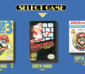
Super Mario All-Stars
Super Mario 3D All-Stars


Brush Script

Brush Script is a script typeface designed by Robert E. Smith for the American Type Founders, first released in 1942.[16] It is used in Super Mario Odyssey on the Forgotten Isle sticker.
Cancun
Cancun is a sans-serif typeface from Corel. It is used in the logo for Paper Mario: The Thousand-Year Door.
Carat
Carat (カラット Karatto) is a typeface from Fontworks, first released in 2010.[17] It is used for text in the WarioWatch stage of WarioWare Gold, as well as in Wario's and Dribble & Spitz's levels and in the Play-o-Pedia in WarioWare: Get It Together!, and the logo for Galactic Conquest in WarioWare: Move It!.
WarioWare: Get It Together! Wario stage
WarioWare: Get It Together! Dribble & Spitz stage
WarioWare: Get It Together! Play-o-pedia


Chiaro

Chiaro (キアロ Kiaro) is a sans serif typeface from Fontworks, first released in 1997.[18] It is used for controller setting texts in Luigi's Mansion.
Comet

Comet (コメット Kometto) is a sans serif typeface from Fontworks, first released in 2010.[19] It is used for the logo for Sly Angle in WarioWare: Get It Together! and the text in the Volcano Wario stage in WarioWare: Move It!.
Comic Sans
Comic Sans is a sans-serif typeface designed by Vincent Connare for Microsoft, first released in 1994.[20] It is used on the "Welcome" sign in the Mushroom Castle area in Super Mario RPG for the Nintendo Switch.[21]
Compacta
Compacta is a sans-serif typeface designed by Fred Lambert for Letraset, first released in 1963.[22] It is used for the logo for Donkey Kong Country 2: Diddy's Kong Quest.
Cuckoo

Cuckoo (カッコウ Kakkō) is a Point of Purchase typeface designed by Tomomi Kanda for Fontworks, first released in 2021.[23] It is used for text in Dribble & Spitz's stage in WarioWare: Move It!.
DF Gothic

DF Gothic (DFゴシック体 DF Goshikku-tai) is a sans serif typeface from Fontworks.[24] It is most prominently used in Super Smash Bros. games, with the exception of Ultimate. In the original Super Smash Bros., it is used for pre-match loading screens in the 1P Game, as well as unlock messages; in Melee and Brawl, it is used for How to Play; and in Super Smash Bros. for Nintendo 3DS/Wii U, it is the primary large text font.
It is also has minor usage in Mario Kart 8 and Mario Kart 8 Deluxe on the Bullet Bill Speed Trials logo, which uses its Ultra Heavy (DFP超極太ゴシック体) font.


DF UD Gothic
DF UD Gothic (DF UDゴシック体 DF UD Goshikku-tai) is a Universal Design sans serif typeface from Dynacomware. It is used for the interface in Super Mario Maker 2 for the Japanese language.
DFP Gyō Kaisho
DFP Gyō Kaisho (DFP行楷書 DFP Gyō Kaisho) is a script typeface by DynaFont. Designed to replicate the brush strokes of Japanese calligraphy, it is used for text from the Temple of Form in WarioWare: Smooth Moves in Japanese and languages using the Latin script.
DIN 2014

DIN 2014 is a sans serif typeface designed by Vasily Biryukov for ParaType, first released in 2014.[25] It is a variant of DIN 1451 and is used for the interface in Super Mario Bros. Wonder and Nintendo World Championships: NES Edition.
DNP Shuei Antique

DNP Shuei Antique (DNP 秀英アンチック DNP Shūei Anchikku) is a sans serif typeface designed by Dai Nippon Printing for Fontworks, first released in 2017.[26] It is used for text in Dribble & Spitz's stage in WarioWare: Get It Together!.
Dom Casual
Dom Casual is a typeface designed by Peter Dom for American Type Founders, first released in 1963.[27] It is used both in The Super Mario Bros. Super Show! and the Donkey Kong Country television series (in its bold variant) for general text, including title cards and credits information. It is also used in the Super Mario World television series for credits only.
Dot Gothic12

Dot Gothic12 (ドットゴシック 12 Dotto Goshikku 12) is a pixelated sans serif typeface from Fontworks, first released in 2006.[28] it is used for text in 9-Volt's stage in WarioWare: Move It! and Patissiere Peach's stage in Princess Peach: Showtime!.
Dot Gothic16

Dot Gothic16 (ドットゴシック 16 Dotto Goshikku 16) is a pixelated sans serif typeface from Fontworks, first released in 2006.[29] It is used for text in 9-Volt's stage in WarioWare: Get It Together!.
Eclat
Eclat is a script typeface from Image Club. It is used for the European/Australasian logo for DK: King of Swing.
El Grande
El Grande is a sans-serif typeface from The Font Bureau. It is used for the North American logo for Mario & Luigi: Dream Team.
Eras
Eras is a serif typeface designed by Albert Boton and Albert Hollenstein for ITC, first released in 1976.[30] Eras Bold is used in Super Smash Bros. Melee for the ordinal number suffixes on the winner screen.
FF CrashBangWallop

FF CrashBangWallop is a sans-serif typeface from FontFont. It is used for the North American logo for Mario Hoops 3-on-3.
FF Mark

FF Mark is a sans serif typeface from FontFont. It is used for the logo for Super Mario 3D All-Stars. It has also been largely used as the main typeface for Nintendo's branding since the release of the Nintendo Switch, such as the logo for Nintendo Switch Online. It is also used for the interface for Nintendo World Championships: NES Edition.
Futura

Futura is a sans serif typeface designed by Paul Renner for the Bauer Type Foundry, first released in 1927.[31] It is used for interface text in Mario + Rabbids Kingdom Battle. In Mario Tennis Aces it is used for some interface text and for light displays on stadium courts.
It is present on the boxart logos for Mario is Missing! (Extra Bold) and Mario's Time Machine (Extra Bold and Extra Bold Condensed), and in the logos for Mario Slam Basketball and Nintendo World Championships: NES Edition.
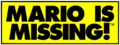
Mario is Missing!

Mario's Time Machine
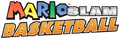
Mario Slam Basketball
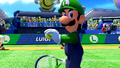
Mario Tennis Aces

GigaG
GigaG (ギガG GigaG) is a sans serif typeface from Visual Design Laboratory (視覚デザイン研究所 Shikaku Dezain Kenkyūjo). It is used for the interface in Mario Golf: Super Rush for the Japanese language.
GigaJr
GigaJr (ギガJr GigaJr) is a sans serif typeface from Visual Design Laboratory (視覚デザイン研究所 Shikaku Dezain Kenkyūjo). It is used for the interface in Nintendo World Championships: NES Edition for display text.
Gill Sans

Gill Sans is a sans serif typeface designed by Eric Gill for Monotype, first released in 1928.[32] It is used for the KONG Letters in the original trilogy of Donkey Kong Country games.
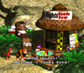
Gill Kayo, a heavy relative of Gill Sans first released in 1936,[33] is used extensively in Donkey Kong Country for interface text (including the "Nintendo presents" splash screen) as well as in-universe scenery text. In Donkey Kong Country 2: Diddy's Kong Quest, it is used once again for scenery signs and also for the Cranky's Video Game Heroes screen.
The Gill Sans MT Pro Display Extra Bold font is used for the logo for Super Mario Run.
Donkey Kong Country player selection
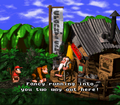
Cranky's Cabin sign
Funky's Flights sign
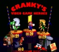
Cranky's Video Game Heroes
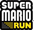
Used for the "RUN" text in the logo for Super Mario Run


Gospel
Gospel (ゴスペル Gosuperu) is an uneven serif typeface designed by Takayuki Kuwahara for Fontworks, first released in 2016.[34] It is used for text in the Variety Tower stages and Copycat Mirror in WarioWare: Move It!.
Gotham
Gotham is a sans-serif typeface designed by Tobias Frere-Jones and Jesse Ragan for Hoefler & Frere-Jones, first released in 2000.[35] Gotham Ultra is used for the logo for Super Mario 3D All-Stars.
Greco
Greco (グレコ Gureko) is a serif typeface designed by Toshiyasu Satō for Fontworks, first released in 1994.[36] it is used as a system font on the Wii.
Handel Gothic
Handel Gothic is a sans serif typeface designed by Donald J. Handel and Robert Trogman for FotoStar, first released in 1965.[37] Handel Gothic with a straight leg on "R", a straight lower leg on "k", and a double-v "w", modified with a short line on the top left of the "1", is used for the interface in Luigi's Mansion 3 for Western languages.
Handel Gothic is also used in the logo for Mario Power Tennis and for the "Mario Tennis" logo displayed on courts in Mario Tennis: Ultra Smash.
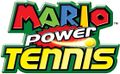
Used for the "Power Tennis" text in the logo for Mario Power Tennis
Mario Tennis: Ultra Smash


Helvetica Neue
Helvetica Neue is a sans serif typeface from the Stempel Type Foundry, first released in 1983.[38] It is a variant of Helvetica and is used in The Super Mario Bros. Movie for street names in the map and the on-screen text both seen in the Super Mario Bros. Plumbing commercial.


Highway Gothic
Highway Gothic is a sans serif typeface designed by Theodore W. Forbes for the United States Federal Highway Administration (FHWA), first released in 1948.[39] It is used for text in The Super Mario Bros. Movie.
Hourei

Hourei (豊隷 Toyore) is a script typeface designed by Kazutoshi Fukuda for Fontworks, first released in 2002.[40] It is used in WarioWare: Move It! for the text for the Forms.
Humming

Humming (ハミング Hamingu) is a rounded sans serif typeface designed by Shigenobu Fujita for Fontworks, first released in 2004.[41] It is used for most of the text in the following games:
- Mario & Luigi: Dream Team
- Princess Peach: Showtime! (Western, Japanese and Russian versions)
Impact
Impact is a sans-serif typeface designed by Geoffrey Lee for Stephenson Blake, first released in 1965.[42] It is used for the logo for Mario Tennis: Power Tour.
It is also minorly used in Donkey Kong Country 2 for the Game Boy Advance for the Cranky's Video Game Heroes banner text.
.png)
ITC Bookman
ITC Bookman is a serif typeface designed by Ed Benguiat for ITC, first released in 1975.[43] It is a variant of Bookman and is used in The Adventures of Super Mario Bros. 3 for episode title cards, in its Bold variant.
ITC Kabel

ITC Kabel is a sans serif typeface designed by Victor Caruso for ITC, first released in 1975.[44] It is a variant of Kabel and is used in Game & Wario in its Ultra variant for display as well as body text. In WarioWare Gold, it is used once again for microgame commands, like in Game & Wario's Gamer.
ITC Kabel is also used prominently in Super Smash Bros., being present also on the game's logo. It is also present on the logos for Mario Kart 64 (Medium), Mario vs. Donkey Kong games (Bold) and Mario Golf: Toadstool Tour (Ultra). Additionally, it is used in the instruction booklets for Super Mario 64 and Mario Party.
ITC Grizzly, a relative of ITC Kabel,[45] is used in Mario Strikers: Battle League for display text.
ITC Kabel Ultra was also used for the logo for the unreleased English version of Nintendo Puzzle Collection.
Super Smash Bros.
Mario Strikers: Battle League

Used for the "SMASH" text in the logo for Super Smash Bros.
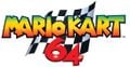
Used for the number "64" in the logo for Mario Kart 64

Used for the "Toadstool Tour" text in the logo for Mario Golf: Toadstool Tour
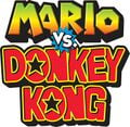
Used for the "VS." text in the logo for Mario vs. Donkey Kong
Nintendo Puzzle Collection unused English version logo


Kafu Techno
Kafu Techno (花風テクノ Hanafū Tekuno) is a sans serif typeface designed by Arphic for Fontworks, first released in 2012.[46] It is used in WarioWare: Get It Together! for Dr. Crygor's stage, and WarioWare: Move It! for text in the Volcano Wario stage, Megagame Muscles, and the logo for Dirty Job.
Khamden Script

Khamden Script is a script typeface from Solidtype. A modified version is used for Bowser and Princess Peach's wedding posters seen in Super Mario Odyssey.
KoreanAMERI

KoreanAMERI (sometimes referred to as "a아메리카노", Americano) is a gothic typeface released by Asiafont in 2013.[47] Its "B" variant is used for almost all text in the Korean version of Princess Peach: Showtime!
Kurokane

Kurokane (くろかね Kurokane) is a sans serif typeface designed by Yoshiharu Ōsaki for Fontworks, first released in 2008.[48] It is used for the sticker text in Mario Party Superstars for the Japanese language. It is also widely used in WarioWare games starting from WarioWare Gold, as well as in Rhythm Heaven Megamix.
Kyo Geki
Kyo Geki (京劇体 Kyō Geki-tai) is an uneven sans serif typeface from DynaComware. It is used for the interface in Luigi's Mansion: Dark Moon for kana and kanji and in the Japanese and American versions of Mario Party 8.
Mario Party 8

LineG
LineG (ラインG RainG) is a sans serif typeface from Visual Design Laboratory. It is used for the interface in Super Mario Bros. Wonder for the kanji.
Lithos
Lithos is a sans-serif typeface designed by Carol Twombly for Adobe Type, first released in 1989.[49] The font, in its Black variant, is employed for certain display text in Donkey Kong Country 3: Dixie Kong's Double Trouble!, Donkey Kong Land III and Wario Land 3 and for general interface text in Donkey Kong 64. Mario's Game Gallery also features Lithos Black for the game's title on the main menu, and Super Mario 64 uses it for the "COURSE" text on course icons.
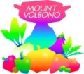
More recently, it has been used for the logo of the Mario & Sonic games (once again in the form of Lithos Black), and has appeared in Super Mario Odyssey as part of the Mount Volbono sticker.
Wario Land 3
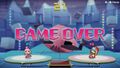
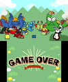
Donkey Kong Country 3: Dixie Kong's Double Trouble! Game Over screen

Super Mario 64
Mario's Game Gallery main menu
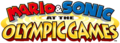
Used for the "OLYMPIC GAMES" text in the logo for Mario & Sonic at the Olympic Games


LogoG
LogoG (ロゴG RogoG) is a sans serif typeface from Visual Design Laboratory. Its Latin characters are similar to Eurostile. It is used for the interface in Super Mario Bros. Wonder for the kana.
Logona

Logona (ロゴナ Rogona) is a sans serif typeface from Visual Design Laboratory. Its Latin characters are similar to Eurostile. It is used for the interface in Mario Golf: Super Rush for the Japanese language and the interface in the Nintendo Switch remake of Super Mario RPG for display text.
Matisse
Matisse (マティス Matisu) is a serif typeface from Fontworks designed by Toshiyasu Satō for Fontworks, first released in 1992.[50] It is used for text in Rising Star in WarioWare: Get It Together! and text in Jimmy T.'s stage in WarioWare: Move It!.
Mystery (ミステリ Misuterī), an uneven relative of Matisse first released in 1998,[51] is used for the location name HUD in Luigi's Mansion and text in 9-Volt's stage in WarioWare: Move It!.
Luigi's Mansion

Neo Sans

Neo Sans is a sans serif typeface designed by Sebastian "Seb" Lester for Monotype, first released in 2004.[52] It is used for the interface in Mario & Sonic at the Olympic Games Tokyo 2020 for Western languages.
Neuland
Neuland is a typeface designed by Rudolf Koch for Klingspor, first released in 1923.[53] It is used in Donkey Kong Country Returns and Donkey Kong Country: Tropical Freeze for display text, such as menu titles and level titles on the map and loading screens, as well as menu text in Returns.
New Cezanne

New Cezanne (ニューセザンヌ Nyū Sezan'nu) is a sans serif typeface from Fontworks, first released in 2008.[54] It is used in WarioWare: Get It Together! and WarioWare: Move It! for display text.
News Gothic
News Gothic is a sans serif typeface designed by Morris Fuller Benton for the American Type Founders, first released in 1908.[55] It is used in Mario Strikers: Battle League for body text.
New Rodin

New Rodin (ニューロダン Nyū Rodan) is a sans serif typeface from Fontworks, first released in 2002.[56] Its Latin characters are similar to Eurostile. It is used for the interface in the following games:
- Mario & Luigi: Dream Team
- Mario Kart 8
- Mario & Luigi: Paper Jam
- Mario Kart 8 Deluxe
- Mario & Luigi: Superstar Saga + Bowser's Minions
- Mario Tennis Aces
- Super Mario Party
- Mario & Luigi: Bowser's Inside Story + Bowser Jr.'s Journey
- Mario Kart Tour
- Mario Kart Live: Home Circuit
- Mario Golf: Super Rush (Western languages)
- WarioWare: Get It Together!
- Mario Party Superstars
- Nintendo World Championships: NES Edition
- Super Mario Party Jamboree
Noyh

Noyh is a sans serif typeface from Typesketchbook. It is used in Mario + Rabbids Sparks of Hope in its R Medium variant for body text.
Optima
Optima is a sans-serif typeface designed by Hermann Zapf for the Stempel Type Foundry, first released in 1958.[57] It is used for the logo for Princess Peach: Showtime!. It is also minorly seen in Super Mario Odyssey, where it is featured in the Tostarena sticker.

Super Mario Odyssey Tostarena sticker

PalRamune

PalRamune (パルラムネ ParuRamune) is a Point of Purchase typeface designed by Akiko Ochi for Fontworks, first released in 2017.[58] It is used for the logo for Balloon Bang in WarioWare: Get It Together! and text in Mona's stage in WarioWare: Move It!.
PalRetron

PalRetron (パルレトロン ParuRetoron) is a typeface designed by Akiko Ochi for Fontworks, first released in 2019.[59] It is used for the logos for Medusa March and Copycat Mirror in WarioWare: Move It!.
Peachy Keen JF
Peachy Keen JF is a sans-serif typeface from Jukebox. It is used for the "Jamboree" text in the Super Mario Party Jamboree logo.
PiePie
PiePie is a sans-serif typeface from Dharma Type. It is used for the logo for WarioWare: Get It Together!
Pop Fury
Pop Fury (Popフューリ Pop Fyūri) is a Point of Purchase typeface from Fontworks, first released in 1998.[60] It is used for the controller setting label and the letters labeling the controller buttons in Luigi's Mansion.
Pop Happiness
Pop Happiness (Popハッピネス Pop Happinesu) is a Point of Purchase typeface from Fontworks, first released in 1997.[61] It is used for the interface in the following games:
- Luigi's Mansion
- Super Mario Sunshine (Western languages)
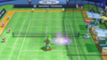
- Mario Power Tennis
- Donkey Kong: Jungle Beat
- Super Mario Galaxy (Western languages)
- Super Mario Galaxy 2 (Western languages)
- WarioWare Gold
- WarioWare: Move It!
It is also used for the logos for the following games:
- Luigi's Mansion
- Donkey Kong Country (Game Boy Color) (Japanese logo)
- Luigi's Mansion: Dark Moon
- Luigi's Mansion 3
- Luigi's Mansion 2 HD
Additionally, in Mario Tennis for the Nintendo 64, it is used on the court selection screen when listing ball speed/bounce.
Luigi's Mansion
Super Mario Sunshine
Super Mario Sunshine
Mario Power Tennis
Donkey Kong: Jungle Beat
Super Mario Galaxy
Super Mario Galaxy 2


Pop Joy
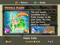
Pop Joy (Popジョイ Pop Joi) is a rounded Point of Purchase typeface from Fontworks, first released in 1998.[62] It is used for the interface in the Paper Mario games for Western languages since Paper Mario: The Thousand-Year Door, as well as Mario Golf: Toadstool Tour. Pop Joy is also used in WarioWare Gold as the text for Penny's stage, as well as the Gelato Beach, Pinna Park, and Pianta Village pages of the Super Mario Sunshine Guide Book.
Pop Joy in Super Mario Sunshine
Pop Joy in Paper Mario: The Thousand-Year Door
Pop Joy in Super Paper Mario
Pop Joy in Paper Mario: Sticker Star
Pop Joy in Paper Mario: Color Splash
Pop Joy in WarioWare Gold
Pop Joy in Paper Mario: The Origami King


POP Mix
POP Mix (POPミックス POP Mikkusu) is a Point of Purchase typeface from DynaComware. It is used for the interface in Luigi's Mansion 3 for the Japanese language.
Puffin Display Soft
Puffin Display Soft is a sans-serif typeface from Bold Monday. Its Black font is used for the logo for Super Mario Bros. Wonder.
Pump
Pump is a sans-serif typeface originally from Letraset. It is used for the logos for the following games:
- New Super Mario Bros. 2 (Pump Bold)
- Nintendo Badge Arcade (Pump Bold)
Used for the number "2"

Used for the "BADGE ARCADE" text

Raglan
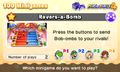
Raglan (ラグラン Raguran) is a sans serif typeface from Fontworks, first released in 1995.[63] It is an Ultra Bold derivative of Rodin. It is used for interface text in Captain Toad: Treasure Tracker. In WarioWare Gold, it is used for text in the Dancing Team and Wario Deluxe's stages. In WarioWare: Get it Together!, it is used for text in Orbulon's stage, the Showdown stage and for the title screen logos for Puck 'er Up and Frenemy Frenzy. In WarioWare: Move It!, it is used for text in Dr. Crygor's stage and text in Switching Gears.
WarioWare: Get it Together! Frenemy Frenzy

RocknRoll
RocknRoll (ロックンロール Rokkunrōru) is a Point of Purchase typeface from Fontworks, first released in 1995.[64] It is based on Rodin. It is used for the interface in Mario Party 10 for Western languages, text in party minigames in WarioWare: Get It Together!, and text in Showdown in WarioWare: Move It!.
Rockwell
Rockwell is a slab-serif typeface from Monotype, first released in 1934.[65] Rockwell Std Extra Bold is used for the logo for Mario Superstar Baseball.
Rodin Maria
Rodin Maria (ロダンマリア Rodan Maria) is a sans serif typeface from Fontworks, first released in 1995.[66] It is Rodin with Maria kana. It is used for the interface in the following games:
- Super Mario Sunshine (Japanese language)
- Super Mario Galaxy (Japanese language)
- Super Mario Galaxy 2 (Japanese language)
- Mario Party 10 (Japanese language)
Rodin NTLG

Rodin NTLG (ロダンNTLG Rodan NTLG) is a sans serif typeface designed by Yutaka Satō for Fontworks, first released in 1997.[67] It is Rodin with New Type Labo Gothic kana. The kana stroke ends are horizontal or vertical. Rodin NTLG is the system font on Nintendo GameCube, Wii, Nintendo DSi, Nintendo 3DS and Wii U. It is used for the interface in the following games:
- Mario & Sonic games from Mario & Sonic at the Olympic Games to the Nintendo 3DS version of Mario & Sonic at the Rio 2016 Olympic Games for Western languages and the Wii U version of Mario & Sonic at the Rio 2016 Olympic Games for the Japanese language
- Mario Kart Wii
- Mario Kart 7
- Super Mario Maker
- Super Mario Odyssey
- Super Mario 3D World + Bowser's Fury
- WarioWare: Get It Together!
- Super Mario Bros. Wonder (player names)
- WarioWare: Move It!
- Mario vs. Donkey Kong (Nintendo Switch)
Rodin Rose
Rodin Rose (ロダンローズ Rodan Rōzu) is a sans serif typeface from Fontworks, first released in 1995.[68] It is Rodin with Rose kana. It is used for the interface in Princess Peach: Showtime! for display text.
Rodin Wanpaku
Rodin Wanpaku (ロダンわんぱく Rodan Wanpaku) is a sans serif typeface designed by Yutaka Satō for Fontworks, first released in 1998.[69] It is Rodin with New Wanpaku Gothic kana. It is used for the interface in the following games:
- Mario Party: Island Tour
- Yoshi's Crafted World
- WarioWare: Get It Together!
- WarioWare: Move It!
Rowdy

Rowdy (ロウディ Roudi) is a sans serif typeface designed by Toshiyasu Satō for Fontworks, first released in 1995.[70] It is based on Rodin. It is used for the interface in the following games:
- Mario Party: Star Rush
- Mario Party: The Top 100
- WarioWare: Move It!
- Mario & Luigi: Brothership
In Wario Land: Shake It!, Rowdy is used for the "G" on Coin Bags and also for the "ON" and "OFF" on Certainty Switches in the Japanese version only. In WarioWare Gold, it is used for text in the Potluck Gang stage. It is also used for the "Puzzle & Dragons" portion of the Puzzle & Dragons: Super Mario Bros. Edition logo, and the "Arcade Edition" portion of the logo for Mario & Sonic at the Olympic Games Tokyo 2020 - Arcade Edition.
Mario Party: The Top 100
WarioWare Gold
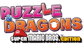
Puzzle & Dragons: Super Mario Bros. Edition
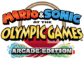
Mario & Sonic at the Olympic Games Tokyo 2020 - Arcade Edition


Seurat

Seurat (スーラ Sūra) is a rounded sans serif typeface from Fontworks, first released in 1993.[71] It is used for the interface in the following games:
- New Super Mario Bros. Wii
- Super Mario 3D Land
- New Super Mario Bros. 2
- New Super Mario Bros. U
- Paper Mario games since Paper Mario: Sticker Star (Japanese language)
- New Super Luigi U
- Super Mario 3D World
- Mario & Luigi: Paper Jam
- Mario Party: Star Rush
- Mario & Luigi: Superstar Saga + Bowser's Minions
- Mario Party: The Top 100
- Mario & Luigi: Bowser's Inside Story + Bowser Jr.'s Journey
- New Super Mario Bros. U Deluxe
- Super Mario Bros. 35
- WarioWare: Get It Together!
- WarioWare: Move It!
- Super Mario RPG (Nintendo Switch)
- Paper Mario: The Thousand-Year Door (Nintendo Switch) (The Letter "p")
- Mario & Luigi: Brothership
Seurat Capie
Seurat Capie (スーラキャピー Sūra Kyapī) is a rounded sans serif typeface designed by Yutaka Satō for Fontworks, first released in 1995.[72] It is Seurat with Capie kana. It is used for the interface in the following games:
- Paper Mario: The Thousand-Year Door (Japanese language)
- Super Paper Mario (Japanese language)
Showcard Gothic
Showcard Gothic is a sans-serif typeface from The Font Bureau. It is used for the logos for the following games:
- Super Mario RPG: Legend of the Seven Stars
- DK: King of Swing (North American logo)
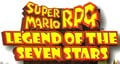
Used for the "LEGEND OF THE SEVEN STARS" text
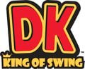
Used for the "KING OF SWING" text
Skip
Skip Pro (スキップ Pro Sukippu Pro) is a humanist sans serif typeface designed by Shigenobu Fujita for Fontworks, first released in 2019.[73] It is used for the interface in the following games:
- WarioWare: Get It Together!
- WarioWare: Move It!.
Slump
Slump (スランプ Suranpu) is a rounded sans serif typeface from Fontworks, first released in 1995.[74] It is based on Seurat. It is used for subtitles in Super Mario Sunshine, pop-up boxes in Mario Kart: Double Dash!!, display text in Donkey Kong: Jungle Beat, text in the Wario Bug stage in WarioWare: Get It Together!, and text in Pyoro W and subtitles in WarioWare: Move It! to denote characters and locations. In WarioWare: Smooth Moves and WarioWare Gold, it is used for text in Ashley's and Orbulon's levels respectively.
Mario Kart: Double Dash!!
WarioWare: Smooth Moves
WarioWare Gold


Snell Roundhand

Snell Roundhand is a script typeface from Linotype. It is used in Super Mario Odyssey in the Bubblaine sticker.
Sō Gei
Sō Gei (綜藝体 Sō Gei-tai) is a sans serif typeface from DynaComware. It is used for the interface in the following games:
- Super Mario Maker (Japanese language)
- Super Mario Maker 2 (Japanese language)
- Luigi's Mansion 3 (Japanese language)
- Mario Party 8
Stencil

Stencil is a serif typeface designed by Gerry Powell for American Type Founders, first released in 1937.[75] It is seen in Super Mario Odyssey, where it is used on the sticker for the Steam Gardens, albeit with a modified "R" glyph.
Stick
Stick (ステッキ Sutekki) is a typeface from Fontworks, first released in 2009.[76] It is used for the interface in Super Mario Sunshine for the Japanese language, the interface in Super Mario Galaxy and Super Mario Galaxy 2 for the kana, and the text in Dribble & Spit's stage in WarioWare: Move It!.
Taberna Serif

Taberna Serif is a typeface from Latinotype. Its Black variant is used for the "Brothership" subtitle of the Mario & Luigi: Brothership logo.
The Bold Font
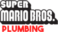
The Bold Font is a sans serif typeface from Sven Pels. It is used in The Super Mario Bros. Movie for the logo for Super Mario Bros. Plumbing and location names in the Super Mario Bros. Plumbing commercial.
Used for the "PLUMBING" text

TheSans

TheSans is a sans serif typeface from LucasFonts, designed by Lucas de Groot. A version of this typeface, TheSans Rio 2016, is used for the interface in the Wii U version of Mario & Sonic at the Rio 2016 Olympic Games for Western languages.
Times New Roman
Times New Roman is a serif typeface designed by Stanley Morison and Victor Lardent for Monotype, first released in 1937.[77] It is used for the logo for Mario & Luigi: Partners in Time.
UD Kakugo
UD Kakugo (UD角ゴ UD Kaku go) is a Universal Design sans serif typeface from Fontworks, first released in 2015.[78] Its Latin characters are classified as humanist. It is used for the interface in Super Mario Maker 2, Tetris 99, and Princess Peach: Showtime! for Western languages.[citation needed] It is also used for the sticker text in Mario Party Superstars for Western languages and the logo for The "Who's in Control?" Show in WarioWare: Move It!.
UD Marugo
UD Marugo (UD丸ゴ UD Maru go) is a Universal Design rounded sans serif typeface from Fontworks, first released in 2015.[79] It is used for the interface in Super Mario Party for Western languages and for text in Pyoro W in WarioWare: Move It!.
UD Mincho

UD Mincho (UD明朝 UD Minchō) is a Universal Design serif typeface from Fontworks, first released in 2015.[80] It is used for the logo for Gotta Bounce in WarioWare: Get It Together!.
UD Shin Go

UD Shin Go (UD新ゴ UD Shin go) is a Universal Design sans serif typeface from Morisawa. Its Latin characters and numerals come from ClearTone SG, a humanist sans serif typeface also from Morisawa, with slight modifications, particularly in the letter "J". In UD Shin Go, "J" sits on the baseline; while in ClearTone SG, "J" descends below the baseline. UD Shin Go modified with a single story "g" from Latin small letter script g is the system font on Nintendo Switch and is used as the typeface for Super Mario 3D All-Stars, Nintendo World Championships: NES Edition, the classic game applications for Nintendo Switch Online, and the player names on many Mario games on the console. The unmodified UD Shin Go with a double story "g" is used for the interface in Mario & Sonic at the Olympic Games Tokyo 2020.
VAG Rounded

VAG Rounded is a widely used rounded sans serif typeface designed by Gerry Barney for Volkswagen, first released between 1978 and 1979.[81] It is seen in Donkey Kong Country: Tropical Freeze, where it is used for general text.
In Super Mario Odyssey, it is used on the Honeylune Ridge sticker.
Yuruka

Yuruka (ユールカ Yūruka) is a Point of Purchase typeface from Fontworks, first released in 2012.[82] It is used for the interface in the following games:
- Yoshi's Crafted World
- WarioWare: Get It Together!
- WarioWare: Move It!
- Mario & Luigi: Brothership
References
- ^ a b MARIO Font GitHub repository
- ^ Nintendo of America (May 19, 2023). Game Boy Advance – May 2023 Game Updates – Nintendo Switch Online + Expansion Pack. YouTube. Retrieved May 19, 2023.
- ^ fsuarez913 | dafont.com. dafont.com. Retrieved January 31, 2024. (Archived February 1, 2024, 02:16:18 UTC via Wayback Machine.)
- ^ Super Mario 256 - comments | dafont.com. dafont.com. Retrieved January 31, 2024. (Archived July 18, 2012, 192826 UTC via Wayback Machine.)
- ^ @MikeLuckas (January 31, 2024). Post. X. Retrieved February 9, 2024. (Archived January 9, 2024, 17:50:57 UTC via archive.today.)
- ^ Wikipedia. (2024). Ad Lib (typeface). https://en.wikipedia.org/wiki/Ad_Lib_(typeface). Retrieved June 13, 2024.
- ^ Wikipedia. (2024). American Typewriter. https://en.wikipedia.org/wiki/American_Typewriter. Retrieved June 13, 2024.
- ^ Fontworks. Yutaka Sato. https://en.fontworks.co.jp/company/designer/sato-y/. Retrieved June 15, 2024.
- ^ Type Labo. https://www.type-labo.jp/. Retrieved June 15, 2024.
- ^ Wikipedia. (2024) Antique Olive. https://en.wikipedia.org/wiki/Antique_Olive. Retrieved June 13, 2024.
- ^ Fontworks. あおかね Std. https://lets.fontworks.co.jp/fonts/309. Retrieved June 15, 2024.
- ^ Wikipedia. (2024). Arial. https://en.wikipedia.org/wiki/Arial. Retrieved June 13, 2024.
- ^ Fontworks. ベビポップ Std. https://lets.fontworks.co.jp/fonts/220. Retrieved June 15, 2024.
- ^ Wikipedia. (2024). Bauhaus (typeface). https://en.wikipedia.org/wiki/Bauhaus_(typeface). Retrieved June 13, 2024.
- ^ Wikipedia. (2024). Berlin Sans. https://en.wikipedia.org/wiki/Bauhaus_(typeface). Retrieved June 13, 2024.
- ^ Wikipedia. (2024). Brush Script. https://en.wikipedia.org/wiki/Brush_Script. Retrieved June 19, 2024.
- ^ Fontworks. カラット Std. https://lets.fontworks.co.jp/fonts/158. Retrieved June 19, 2024.
- ^ Fontworks. キアロ Std. https://lets.fontworks.co.jp/fonts/196. Retrieved June 19, 2024.
- ^ Fontworks. コメット Std. https://lets.fontworks.co.jp/fonts/160. Retrieved June 19, 2024.
- ^ Wikipedia. (2024). Comic Sans. https://en.wikipedia.org/wiki/Comic_Sans. Retrieved June 15, 2024.
- ^ Shesez (December 1, 2024). Out of Bounds Secrets. YouTube. Retrieved June 15, 2024.
- ^ Wikipedia. (2024). Compacta (typeface). https://en.wikipedia.org/wiki/Compacta_(typeface). Retrieved June 19, 2024.
- ^ Fontworks. カッコウ Std. https://lets.fontworks.co.jp/fonts/3371. Retrieved June 19, 2024.
- ^ Fontworks. DFゴシック体 Pro. https://lets.fontworks.co.jp/fonts/645. Retrieved June 20, 2024.
- ^ Wikipedia. (2024). DIN 2014. https://en.wikipedia.org/wiki/DIN_1451#Third-party_adaptations. Retrieved June 19, 2024.
- ^ Fontworks. DNP 秀英アンチック Std. https://lets.fontworks.co.jp/fonts/261. Retrieved June 19, 2024.
- ^ Wikipedia. (2024). Dom Casual. https://en.wikipedia.org/wiki/Dom_Casual. Retrieved June 19, 2024.
- ^ Fontworks. ドットゴシック 12 Std. https://lets.fontworks.co.jp/fonts/182. Retrieved June 19, 2024.
- ^ Fontworks. ドットゴシック 16 Std. https://lets.fontworks.co.jp/fonts/184. Retrieved June 19, 2024.
- ^ Wikipedia. (2024). Eras (typeface). https://en.wikipedia.org/wiki/Eras_(typeface). Retrieved June 19, 2024.
- ^ Wikipedia. (2024). Futura (typeface). https://en.wikipedia.org/wiki/Futura_(typeface). Retrieved June 19, 2024.
- ^ Wikipedia. (2024). Gill Sans. https://en.wikipedia.org/wiki/Gill_Sans. Retrieved June 19, 2024.
- ^ Wikipedia. (2024). Gill Kayo. https://en.wikipedia.org/wiki/Gill_Sans#Gill_Kayo. Retrieved June 19, 2024.
- ^ Fontworks. ゴスペル Std. https://lets.fontworks.co.jp/fonts/315. Retrieved June 19, 2024.
- ^ Wikipedia. (2024). Gotham (typeface). https://en.wikipedia.org/wiki/Gotham_(typeface). Retrieved June 19, 2024.
- ^ Fontworks. グレコ Std. https://lets.fontworks.co.jp/fonts/92. Retrieved June 19, 2024.
- ^ Wikipedia. (2024). Handel Gothic. https://en.wikipedia.org/wiki/Handel_Gothic. Retrieved June 19, 2024.
- ^ Wikipedia. (2024). Helvetica Neue. https://en.wikipedia.org/wiki/Helvetica#Neue Helvetica. Retrieved June 19, 2024.
- ^ Wikipedia. (2024). Highway Gothic. https://en.wikipedia.org/wiki/Highway_Gothic. Retrieved June 19, 2024.
- ^ Fontworks. 豊隷 Std. https://lets.fontworks.co.jp/fonts/302. Retrieved June 19, 2024.
- ^ Fontworks. ハミング. https://lets.fontworks.co.jp/fonts/142. Retrieved June 19, 2024.
- ^ Wikipedia. (2024). Impact (typeface). https://en.wikipedia.org/wiki/Impact_(typeface). Retrieved June 19, 2024.
- ^ Wikipedia. (2024). Bookman (typeface). https://en.wikipedia.org/wiki/Bookman_(typeface). Retrieved June 19, 2024.
- ^ Wikipedia. (2024). ITC Kabel. https://en.wikipedia.org/wiki/Kabel_(typeface)#ITC Kabel. Retrieved June 19, 2024.
- ^ Wikipedia. (2024). ITC Grizzly. https://en.wikipedia.org/wiki/Kabel_(typeface)#ITC Kabel. Retrieved June 19, 2024.
- ^ Fontworks. 花風テクノ Std. https://lets.fontworks.co.jp/fonts/279. Retrieved June 19, 2024.
- ^ KoreanAMERI. Asiafont. Retrieved 20 June 2024.
- ^ Fontworks. くろかね Std. https://lets.fontworks.co.jp/fonts/312. Retrieved June 19, 2024.
- ^ Wikipedia. (2024). Lithos. https://en.wikipedia.org/wiki/Lithos. Retrieved June 19, 2024.
- ^ Fontworks. マティス Pro. https://lets.fontworks.co.jp/fonts/72. Retrieved June 19, 2024.
- ^ Fontworks. ミステリ Std. https://lets.fontworks.co.jp/fonts/192. Retrieved June 19, 2024.
- ^ Wikipedia. (2024). Neo Sans. https://en.wikipedia.org/wiki/Neo_Sans. Retrieved June 19, 2024.
- ^ Wikipedia. (2024). Neuland. https://en.wikipedia.org/wiki/Neuland. Retrieved June 19, 2024.
- ^ Fontworks. ニューセザンヌ Pro. https://lets.fontworks.co.jp/fonts/84. Retrieved June 19, 2024.
- ^ Wikipedia. (2024). News Gothic. https://en.wikipedia.org/wiki/News_Gothic. Retrieved June 19, 2024.
- ^ Fontworks. ニューロダン Pro. https://lets.fontworks.co.jp/fonts/78. Retrieved June 20, 2024.
- ^ Wikipedia. (2024). Optima. https://en.wikipedia.org/wiki/Optima. Retrieved June 19, 2024.
- ^ Fontworks. パルラムネ Std. https://lets.fontworks.co.jp/fonts/154. Retrieved June 19, 2024.
- ^ Fontworks. パルレトロン Std. https://lets.fontworks.co.jp/fonts/156. Retrieved June 19, 2024.
- ^ Fontworks. Popフューリ Std. https://lets.fontworks.co.jp/fonts/206. Retrieved June 19, 2024.
- ^ Fontworks. Popハッピネス Std. https://lets.fontworks.co.jp/fonts/208. Retrieved June 19, 2024.
- ^ Fontworks. Popジョイ Std. https://lets.fontworks.co.jp/fonts/204. Retrieved June 19, 2024.
- ^ Fontworks. ラグラン Std. https://lets.fontworks.co.jp/fonts/214. Retrieved June 19, 2024.
- ^ Fontworks. ロックンロール Std. https://lets.fontworks.co.jp/fonts/188. Retrieved June 19, 2024.
- ^ Wikipedia. (2024). Rockwell (typeface). https://en.wikipedia.org/wiki/Rockwell_(typeface). Retrieved June 19, 2024.
- ^ Fontworks. ロダンマリア Pro. https://lets.fontworks.co.jp/fonts/222. Retrieved June 19, 2024.
- ^ Fontworks. ロダンNTLG Pro. https://lets.fontworks.co.jp/fonts/236. Retrieved June 19, 2024.
- ^ Fontworks. ロダンローズ Pro. https://lets.fontworks.co.jp/fonts/224. Retrieved June 19, 2024.
- ^ Fontworks. ロダンわんぱく Pro. https://lets.fontworks.co.jp/fonts/2384. Retrieved June 19, 2024.
- ^ Fontworks. ロウディ Std. https://lets.fontworks.co.jp/fonts/212. Retrieved June 19, 2024.
- ^ Fontworks. スーラ Pro. https://lets.fontworks.co.jp/fonts/87. Retrieved June 19, 2024.
- ^ Fontworks. スーラキャピ Pro. https://lets.fontworks.co.jp/fonts/242. Retrieved June 19, 2024.
- ^ Fontworks. スキップ Pro. https://lets.fontworks.co.jp/fonts/144. Retrieved June 19, 2024.
- ^ Fontworks. スランプ Std. https://lets.fontworks.co.jp/fonts/190. Retrieved June 19, 2024.
- ^ Wikipedia. (2024). Stencil (typeface). https://en.wikipedia.org/wiki/Stencil_(typeface). Retrieved June 19, 2024.
- ^ Fontworks. ステッキ Std. https://lets.fontworks.co.jp/fonts/164. Retrieved June 19, 2024.
- ^ Wikipedia. (2024). Times New Roman. https://en.wikipedia.org/wiki/Times_New_Roman. Retrieved June 19, 2024.
- ^ Fontworks. UD角ゴ_ラージ Pro. https://lets.fontworks.co.jp/fonts/107. Retrieved June 19, 2024.
- ^ Fontworks. UD丸ゴ_ラージ Pro. https://lets.fontworks.co.jp/fonts/120. Retrieved June 19, 2024.
- ^ Fontworks. UD明朝 Pro. https://lets.fontworks.co.jp/fonts/103. Retrieved June 19, 2024.
- ^ Wikipedia. (2024). VAG Rounded. https://en.wikipedia.org/wiki/VAG_Rounded. Retrieved June 19, 2024.
- ^ Fontworks. ユールカ Std. https://lets.fontworks.co.jp/fonts/218. Retrieved June 19, 2024.